
We live in interesting times… the worst nightmare for a university sector heavily financed by foreign-student revenues has arrived: A global pandemic. Borders closed, revenues declining precipitously, and a government reluctant to bail the sector out.
Salaries in Australian higher education have been a topic I’ve wanted to get to for some time but I’ve avoided it a little as it’s depressing and inflammatory. There are definitely winners and losers. And like any corporation, the winners are almost universally at the top. Now, the crisis, resulting quarantine lock-downs, and two articles in the media this week have converged to push me over the precipice on a long delayed project.
Let me begin with the two articles. It started for me with Merlin Crossley’s opinion piece in the Sydney Morning Herald this week. I agree with some parts of the article, but one part in particular got my ‘yeah, nah, that doesn’t square up’ going, it was:
That’s not untrue, but if you think deeply about it, that picture is not completely true either. Sure. there’s not a ‘profit’ in the corporate balance sheet sense, where you divide up the revenue minus costs and return it as dividend to shareholders who bought equity in your company on the stock market. But… some people sure make a hell of a lot more money out of this new system compared to the standard of an Australian public university of the 1990s and earlier! They might not be share-holders per se. They’re more employees that get serious returns on the business turning ever greater fee revenues.
The self-interest of increasing pay packets in a climate of reduced regulation, spread across dozens of executives over two dozen institutions and 20 years, has driven what anyone with a pair of eyes and some critical assessment skills can see is a massive corporatisation of a public service once run efficiently to minimise costs to the public who use it. Gone are the days when an entire bachelors degree would set a student back maybe $10,000 at most (or even be free going far enough back). Now we charge them several times that, all for super-flashy campuses that look like Westfield malls and courses so compressed as to be almost impossible to teach and impossible to learn.
Now imagine you’re stuck at home in quarantine, without work. And the education minister suggests you might want to retrain. Since huge numbers of Australians now have an undergraduate degree, those are inevitably going to be postgraduate options without commonwealth support. So, you go look at a Grad. Cert. or a Masters, and see that an online degree is going to cost you $30,000/year minimum. Ouch, that’s a lot of upfront when you just lost an income. The appeal in this article to being simply ‘a registered charity’ and all about the community is going to grate with many, who will have a response ranging from a snort to spat coffee, I suspect.
The other was Michael Sainsbury’s article on michaelwest.com.au a few days earlier. This made an attack commonly thrown against the modern higher education sector, namely that VCs and other senior executives earn way too much for institutions that are public sector organisations. And that if they want to run them like corporations, and earn corporate salaries in the process, they need to accept some of the responsibilities of risk management in the corporate sector, like not putting all your eggs in one basket. The article has some fair points amongst a sea of trying to whip sensationalism at the salary numbers. Some colleagues told me this article was unfair; another told me to go look at the top ASX100 CEO salaries and see if I still think the article is valid. I’ll get to that below…
The truth, in most things in the media these days it seems, is somewhere in the middle. And so I figured I’d try to find the reality, and then use some numbers to point at where things really are. Two days of data mining follow below, much of it raking through 25 years of university enterprise agreements on the Fair Work Commission Website.
Back into history: At the core here is the ‘corporatisation’ of the modern university. No one knows how or when it was decided, it just sort of happened. Historically, the major universities in Australia were public organisations, with staff essentially an arm of the public service. You can see this as late as 1995, where the salaries across the universities were standardised and the academic pay charts of universities matched those in the Australian Public Service Enterprise agreements (EAs). It didn’t matter if I worked at UTS or Monash, Murdoch or Melbourne, a Senior Lecturer (B6) earned $50,111 in 1995 and a Professor (E1) earned $80,176. Higher positions were just loadings, for example, in the University of Wollongong EA from 2000, you can see a Head of School’s loading of $4,648 and a Dean’s loading $20,359 on a $92,968 E1 salary. I’m pretty sure back in the 80s & 90s the executive branch (Dean & above) was nowhere as large as it is now. The faculty was a small office, there was maybe a DVC or two.
The regulation of salaries ended about 1997, and the universities all went their own way soon after. At least at the standard levels B6 through E1. You can easily map them as a function of time. Executive salaries are much harder, there’s little data available, even in the few ‘senior staff EA’s that were popular in the mid-00s. I’ll just do some numbers on them later. There’s also the oft-forgotten workforce of universities — the Ph.D. students — I will get to them also.
Does International Student Percentage Affect Salary? The first thing I wanted to look at was the effect of international students, since it’s something Sainsbury’s article alludes to. There was a nice plot from the Centre for Independent Studies recently, which I show below. International student percentages range from below 5% to as much as 45%, surely that should have some effect on salary.

I chose as my set to analyse 8 from the top 11 in the graph below: RMIT, Wollongong (UoW), Monash, Murdoch, Melbourne, UNSW, UTS and UQ. A mix of Go8 and non-Go8, spread geographically. Some in capitals, some not. I also took three with low internationalisation levels: University of New England (UNE), University of Western Sydney (UWS — rebranding, bah, I’m a Campbelltown kid, it’ll always be UWS to me 🙂 ) and University of Tasmania (UTas). I went for more established universities here, mostly as I really want to get back to 1995 with all of them, so I can see how they all evolved from a common salary level.
To keep this sensible, I went for the top rung of Academic level B, to capture what would be a relatively junior academic but almost certainly permanent to have made Step 6. The other obvious one to go after was Professor (E1); I will deal with the mysterious ‘super professors’ later on. Let’s not waste any more time, onto my first graphs.
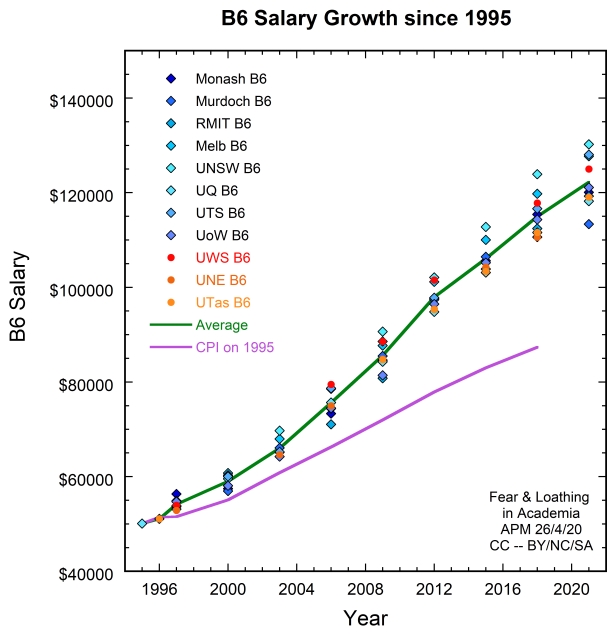

The universities with high international fractions are blue diamonds, low international fractions are red-orange circles. The trend lines are average in green and CPI projection of 1995 salary in purple (using RBA’s online inflation calculator). I don’t care much for people picking which campus is which, it’s less relevant, but you can ask me if you want the data (happy to share it). Ultimately, it’s not clear that being at a campus with a higher international fraction confers much pay advantage on the salary at a given level for the non-executive staff. But there’s a missing piece in the puzzle here that requires a quick look at another graph, this one on the breakdown of the academic workforce.
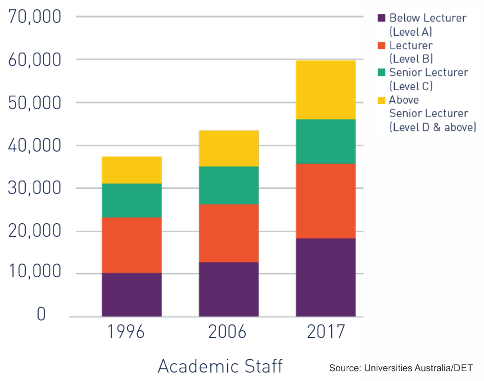
The data above is national and includes both permanent and casual academic staff. I can see two things in it. The first is the huge growth in Lv A, which is essentially just a big increase in casualisation in the higher education sector. Causalisation keeps Lv A’s at Lv A either through churn (Ph.D. students come, teach, move on and are replaced by new students) or by preventing rising in the system (side effect of churn, you are easily replaced if you don’t like your level). The other is the huge growth in Lv E and to some extent Lv D. My guess, and I can’t support it with available data, is that the fattening of Lv D and Lv E has happened more strongly at the campuses where the international fraction is higher. I can back it with anecdata (i.e., talking to lots of colleagues at lots of different campuses about what their campus demographics look like), but to be solid on this, someone really needs to get the same data as above, comparing between 1996, mid-00s and recent but fine-grained enough to see individual universities.
Let me be clear, what I’m pointing to here is that the profit for staff from increased internationalisation comes less in the rise of the salary at a given academic level and step but more in the ease of access to higher academic levels. The salary tables are always going to be pinned by inter-university competition for staff — it’s the thing a new hire can see when you are courting them during recruitment. Promotion processes are less transparent. And it is not as simple as them just ‘being easier’ at some places than others, there’s also a strong component of Mathew effect involved. But either way, there’s a trend.
If nothing else, it’s much as a colleague at another campus quipped when I congratulated him on getting to Prof. many years ago: “It’s nice, but Level E is really just the new Level B.” And given this, I think for any staff member that’s moved up the system into the ever fattening Lv D and E to say they haven’t personally gained from internationalisation of the system is simply untrue, because not only are you sliding up an exponential but you are jumping up the cascade of exponentials, it’s a double-whammy. This is not insubstantial as a systemic profit because a small win integrated over a large number of people has a pretty big cost. But you certainly can’t miss it when you travel — when people in countries with strongly public (non-corporatised) university systems ask what the salaries are like here, just watch their eyes when you give the answer.
What about the public sector then? To further explore the growth in a given academic level/step, I went and did some comparison to what’s left of public sector science & technology here. The obvious choice is CSIRO of course. In the deep past the universities and CSIRO were closer counterparts in the ecosystem of science & technology in Australia. To do this comparison, I looked at the closest levels in salary in 1995 to B6 and E1. These are CSIRO Levels 6.1 and 8.2, I also tracked their highest level 9M in my data, but only present it in my final graph at the end. To get a ‘control sample’, I also looked at the Australian Public Service system, which is tricky, as it restructured in the late 90s and some of the EAs aren’t available in the early 00s. So I tracked the bottom and top of the APS executive levels (EL1.1 and EL2.7) in recent years, just to see what government non-science salaries are doing.
The results knocked my socks off at first, and I suspect I may instigate an insurrection in CSIRO with the graph below (hold onto your hats kids).
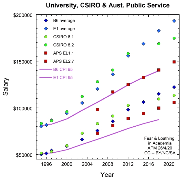
The CSIRO salaries tracked well early. Taking my academic hat off, I’m not surprised, they’re somewhat closer to the applied/industrial side so the salaries should be higher (just the old money-freedom continuum of academia). Something alarming happens in 2012 though. If you look back at the university data, you can see the same inflection in the average line but it’s less severe. I suspect this is the late days of Gillard/Rudd and the quest to regather a surplus followed by the austerity of Abbott/Hockey. Either way, CSIRO staff are losing ground lately, they aren’t even keeping up with salary progression rates for the APS any more!
One hypothesis for this could be that government is withdrawing funding for science across the board — both CSIRO and universities — and the universities are doing a better job of filling the gap by selling educational services internationally. Still, there isn’t a massive divergence here to suggest that internationalisation is massively beneficial at fixed level/step. It’s still the level-promotion aspect I mentioned earlier where I think the big gains come.
I might come back to staff down below, because if I’m getting into promotion, I need to look at the top end. I want to look the other direction for a moment, to the true workhorse of the university research sector: the Ph.D. students.
Corporations love cheap labour: One of the long-standing ethical issues I’ve had with higher education for some time now has been the way it uses Ph.D. students. A lot has changed in 25 years, let’s go back in time before I look at some data.
I was a university student of the 1990s. I did my first year in 1993, completed a B.Sc. (Hons) in Physics in 1996, and then did a Ph.D. from 1997 to early-mid 2000 before leaving for the US for a postdoc. The only reason I could afford to do this was that university was relatively well subsidised by the public of Australia. I grew up a few blocks from one of Sydney’s notorious nasty suburbs (Airds) in a family of 7. We weren’t in total poverty, but we were hardly well off either. It was only Whitlam’s legacy that meant I even stood a chance of getting where I am now. I could suspend the fees and not end up in massive debt in the process. I finished my 4 years with a HECS debt of $9,700 ($16,742 in 2019 dollars). Were I to do the same degree today, I would be up for $38,100 ($22,000 in 1996 dollars) with domestic fee support. And without that, I’d be in debt to the tune of $191,000 at the age of 21! Nonetheless, owing $38,000 and owing $9,700 are a big difference at that age, especially when you look at the massive differences in employment opportunities, wages growth and the housing sector between 1995 and 2020.
A Ph.D. was also a different prospect back in the 1990s. The stipend was reasonable, the cost of living in Sydney was even more reasonable, and the future prospects were quite strong on the opportunity side. Postdoc positions were easily obtained, and it was clear that plenty of academic positions would be opening in the future too. I found a $150/week apartment in Bondi Beach, a place where no one of sane mind wanted to actually live in 1997 it should be said (it took the olympics and reality tv to bring them back). I kept my finances tight, and got to work.
If I look to 2020, I really do have questions about whether I would make similar decisions to the ones I did in 1995. The ratio of RTP to cost of living is now, quite frankly, poor. The job prospects are similarly dire, to the point where the postdoc in Australia is becoming rapidly an extinct species (see my earlier post on this). And as for academia, why would you want to get in on the bottom level of an obvious Ponzi scheme, especially one this ripe for financial collapse.
That said, I’m totes recruiting, kids, because… well… do I have any choice? Generating the ever-growing output metrics required to compete in this system on my own, with my teaching and admin load, yeah right. And we can forget hiring postdocs in the not-too-distant future, they’re becoming a luxury you cannot afford without multiple grants (plugging my post again, so shameless 🙂 ). What one really needs is Ph.D. students, they are the labour force of modern academic science after all. They truly are the ones who get the real work done, and very cheaply too. To quote a certain past PVC “Why hire a postdoc? They’re too expensive. No, ask for the postdoc, but when you get the salary, hire 4 students instead, it’s so much cheaper”. I’ll leave debates of efficacy for the pub, but let’s drill into the economics on Ph.D. students. I’ve wanted to do this for a long time now, and I keep putting it off as it’s incredibly depressing. Let’s do this in two graphs.

The plot above has E1 and B6 data from earlier, along with APA/RTP in green and the salary for an Australian Public Service Cadet in red. I’ve gone with the log axis to make this less embarrassing (you’ll see why if you read that other post I keep plugging), and I’ve dashed some of the CPI lines for distinguishability. Before I unleash years of pent up bile, let me drop my second graph on the table.

In the second graph I go from annual to weekly and I dug back into my archives for some of my budgets from that era. In 1996, when I started, my rent was $150/week. There was no way I could do a Ph.D. with a 1.5 – 2 hour commute each way each day. I had already spent a decent part of my honours year sleeping on the couch of the Physics student society common room (and made good friends with the cleaners and security to get away with it; people tight for cash can always spot people tight for cash). My living costs were about $100/week, tinned spaghetti on toast was a regular meal. That left $40 discretionary, which was a reasonable amount in 1996 dollars. Thankfully, there was casual teaching on campus and my supervisor gave me a top-up, the same $5,000 amount we have now actually, which hasn’t moved partly to prevent financial arms races for students and partly, more recently, because funding is always tight. It is one of many things associated with Ph.D. student funding that shifts at truly glacial pace (travel scholarships are another), especially when compared to how rapidly salaries across the board, and particularly at executive level, have grown. Did someone say we were reinvesting the revenue back into the system? Because if we are, the Ph.D. students certainly aren’t seeing much of it! (n.b. some universities are shifting on this, to their credit, but it’s hardly universal).
It’s interesting to project my scenario from 1995 forward. I’ve had the APA data needed to do it for a while, it was just knowing how ugly the numbers were likely to be that stopped me. The black diamonds are the base income, and the tricky bit is rent. I’ve taken the rent and done three things: a simple CPI projection is the purple line, a proper analysis using rental yield history data (ABS, happy to supply, but it’s a distraction to show) in yellow, and the real rental in red. I just use CPI for living costs (it’s what CPI is after all 🙂 ) and then discretionary is APA minus rent and living costs. It looks ok if you assume the projected rent, except when you realise that $40 in 1996 dollars is $70 in 2019 dollars, yet the discretionary spend is $40 still in 2019. The APA/RTP really has been shaped to ensure it’s ‘just enough’. To highlight that, I’ve put in the poverty line (50% of median salary) for both 1995 and 2020, and yes, I’ve already had one person on twitter comment that they are glad to see it there as they always thought it felt that close.
The problem is… the projected rent data is a national figure, and as we all know, universities are typically in cities and often close to the CBD. Rents there grow much more explosively. I first saw this just before I moved out in 2000 — the olympics were coming, the landlord wanted to increase my rent by 20%, but preferred if I moved out so they could charge even more (letter was something like, if you intend to move out by date, we will forego the increase). It got smashed again in 2016 when it got sold (possibly as deceased estate) to an investor. Either way, rents in Sydney are nothing like the yellow projection and it’s easy for an APA/RTP to evaporate on housing costs in the major capitals. Casual work for Ph.D. students in the modern era is a necessity rather than a way to buy discretionary spend.
But let me come back to the first graph for a second, because when you look at it after the second graph, there’s something sinister. Firstly, the APS Cadet salary, which started well below the APA, has actually risen above it with time. The thing to realise here is that the cadet salary is, essentially, a short-term paygrade in the APS for interns and temporaries (e.g., vacation students). No one is meant to be on cadet pay very long. But when you take an RTP, you’re on it 3-5 years. There are Trainee and Graduate Trainee levels above cadet in the APS that, at 2018 rates are $43,750 and $58,231, i.e., 162% and 215%, of an RTP. To put it bluntly — in salary terms you would be over two times better off going to work for the Australian government as a trainee instead! And that’s before we even get to the private sector. The fact that the APA/RTP has tracked like that on real world terms is remarkable, the only thing I can think to be as bad is Newstart. The people who generate most of Australia’s scientific productivity get paid peanuts to do so folks…
And before people tell me that the lower pay during an RTP pays off later as a post-doc and academic, let me point out that it did, once, back in the late 90s and early 00s. But then we used internationalisation to build an oversupply of Ph.D. graduates because we were addicted to them as a cheap labour force. It enabled us to funnel money into academic salaries and fancy buildings when the one thing we absolutely should have been doing was building a sustainable and equitable sector. Sainsbury does have a point in his article, he’s just missing some parts of the dereliction of duty of higher education management collectively in Australia. This is not just one VC or university alone. Stating names and numbers is a sideshow. This is over two decades of endless short-sightedness and ‘get-rich-quick’ schemes and league-table games from an entire sector of people demanding the sort of salaries people pay to have things managed properly and then utterly failing to do so. Maybe academia does need to be burned to the ground, because I really don’t know how we fix it in the state it’s currently in.
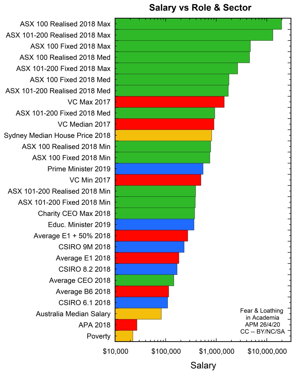
Back to the top: I want to come back around now onto a final graph to finish up the discussion. The thing that caught me with Sainsbury’s article is that it’s full of series of large numbers, and numbers are hard to accurately gauge as just numbers because emotion can become your ruler and emotion has a non-linear scale. I prefer to see them on a graph with a bunch of other things, and so I set out to make that graph.
My colleague of the ‘E is the new B’ quip saw me post the Sainsbury article somewhere and threw the top 10 ASX 100 CEO salaries at me, said ‘Are the salaries that large? They are very modest by industry standard.’ Sure, but last time I checked, we still worked for the public sector. Our job is to train the next generation and produce science not maximise revenues and generate growth. It’s exactly as Merlin says (although the registered charity thing I still find a little bit of a stretch given we put students into $38,000 of debt at age 21 as part of our operation).
The thing about CEO salaries is that people only see the big ones. Those big salaries are the exception rather than the rule, and using them is a convenient way to make the VC salaries look small and shrink the appearance of greed and self-interest involved. The data in the figure below is in part my own, and some from the Australian Council of Superannuation Investors (ACSI) Annual Survey of ASX200 Chief Executive Remuneration. It does a good job of covering the true CEO salary spectrum. Note that below there is a ‘fixed salary’, which is what they get paid even if bonuses are zero, and a ‘realised salary’, which is the whole package, some of which may be equity (whether it is liquidated immediately or not is a separate question).
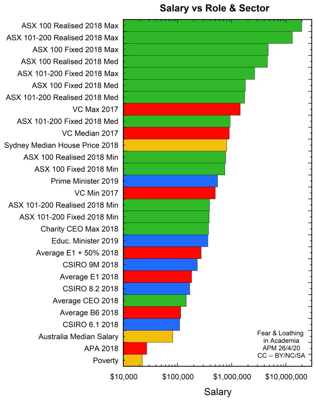
To explain the colour-codes: green is corporate, blue is public service, red is academic and yellow are just benchmarks for context (my control samples). I had to put a log scale on this as well, same reason as before, it’s less embarrassing (can share the non-log version later perhaps). I’ve also included what I call a ‘super professor’, these are a growing breed in the internationalisation era — people of sufficient ‘merit’ that they sit above the publicly listed pay scales. I’ve had to make an estimate for what they get paid, and this might be towards the top end of it across the sector (folks can comment, it’s hard to get good info on this for obvious reasons). The ‘super-professor’ is essentially the core of my colleague’s comment about ‘Lv E is the new Lv B’, Lv E1 is just the entry point to a new range of clandestine pay-scales one can access. The transparency on them varies — some campuses just don’t advertise them others will try to deny they even exist. In some ways, you can consider these as returning an extra share of revenue to a special class of employees — more what a corporation does than a public sector organisation. Then there’s all the executive salaries, they are unknown and are not just academics — I’ve heard several cases of non-professorial admin staff on upwards of $0.5M in this sector. The VC is always the top, obviously, and if you look at that graph, they truly are in amongst the corporate salaries now. The VC minimum there is an exception rather than a rule too — it is one single VC that’s below the PM (see here — also I don’t consider the University of Divinity to be serious, sorry.)
The interesting thing is if you extrapolate the VC being the top salary in a university to the public sector. Clearly in the public sector the top of the pyramid is the PM, right, and even the education minister would outrank any individual vice chancellor. Yet, the minimum VC package is nearly double the education minister’s salary, and the highest has a multiplier exceeding 4! You can possibly see why the Education Minister might be a little unhappy about the salary situation given the graph above… and laugh at any suggestion we’re still a public sector organisation in dire need of bail-out. Executive pay cuts of 20% are barely a sip of the glass when you look at the real numbers!
You’ll also note that the VC salary bracket sits neatly amongst the ASX 101-200 salaries and well above what’s typical for CEOs outside the ASX200. As Sainsbury points out, we’re way beyond even the maximum end of the charity sector on CEO salaries, let alone the typical (don’t forget the log scale!).
For some final context, let’s consider VC salaries in a historical context. Let me choose two examples here. Prof. Spence at U. Sydney has a 2017 salary of $1,445,000, which translates to $845,000 in 1995 dollars. I’m pretty sure VC salaries were nowhere near that large back in 1995, given an E1 was $80,000 and a Dean’s loading would have been less than $20,000. Maybe someone long retired can go on the record and tell us what the VC salaries were really like back then. And there’s always the old chestnut that you need to pay good money to get good leaders who give good results. If that’s true, then clearly Sydney University should be well ahead of ANU, given Brian Schmidt does the same job for reportedly $618,000 in 2017. This is $361,500 in 1995 dollars, and might be somewhat more realistic to an actual VC salary in those days (albeit a fat one perhaps). Amusingly, ANU is ranked well above U. Sydney — so much for money buying performance.
I think it’s quite clear there are definite winners and losers in the 2.5 decades of internationalising the higher education sector and that some have profited very handsomely from the whole exercise. It makes any claim that this is ‘all for the community’ likely to be received a little distastefully I think.
It’s clear that the closer you are to the top and the earlier you entered the better your wins are. The academic system was historically easier to navigate. Grants were easier to get and more likely to be both funded and fully funded. The publishing system was easier and the productivity demands in terms of volume and rate of output were not as severe and more easily resourced. This fed heavily off ramping international enrolments and investment in the 00s and easy access to cheap labour in the form of Ph.D. students. Much like CO2 in the atmosphere, in the early days, the swelling numbers of Ph.D. graduates and young postdocs seeking fellowships didn’t matter — lots of the old guys were retiring, particularly since the old super system was so generous. There was still room in the funding systems and department structures. Positions were filled, and then things got tighter and tighter as the years went on, early 10s were hard, late 10s got really tough. It’s been glaringly obvious for some time there’s a big resourcing problem coming. I can’t work out whether the folks running this show are ignorant, negligent or willfully blind to it. Do they not know? Are their heads in the sand instead? Is it the next VC’s problem? Where are the opinion pieces pointing to a solution rather than trying to shove the bill for the expensive dinner back onto the taxpayer?
One thing’s for sure, higher up in the system, the Mathew effect tends to protect you. Lower down, it’s rapidly becoming carnage. You’ll have seen Darren Saunders talk about the issues on the funding front, and he isn’t the first or the last of the researchers now in their 30s & 40s who will end up getting closed out of the funding system and need to put their research efforts on ice. Everyone I know on campus in their 30s & 40s is sure it’s coming for them. For all the bold talk about revenues being invested back into research and teaching operations, it always seems to be the funds that keep labs going when the external funding runs dry that get cut first. Meanwhile, certain labs flush with cash get more funneled in, so much that they sometimes barely know what to do with it. We all know where the best equipment is! And the pads and plastic pens and plastic rulers with the research centre logo on them are when the stationary supply runs dry. And it’s not like the 80s where you probably got funded unless your proposal was really crappy; now your proposal can be supremely awesome and still miss out again and again. It’s only the upper 2-sigma tail that gets any external funding these days. The reality of ‘reinvesting back into research’ is that most young researchers are running on fumes, burning themselves out and destroying their mental health in competitive processes that are massively stacked against them.
Nah, we (and I mean the sector as a whole) built a Ponzi. We got told to look to international opportunities to help supplement the extra money we kept asking for. We aren’t responsible for being asked to do that, sure. But we sure as hell are responsible for the way we responded in the follow-up.
We could have done that maturely, with an eye to sustainability, without being like hungry pigs to a money trough. We could have done it in such a way that we didn’t jack up the fees on our local students to saddle them with five-digit debt levels at age 21. We could have done it in such a way that students weren’t being admitted despite insufficient preparation just to rake in money on fees (and without then nuking people for calling it out as a problem). We could have done this in a way such that the people who generate the results at the coalface and do the painful parts of the teaching — our Ph.D. students — don’t have to live just above the poverty line while watching the VC’s annual salary grow to exceed the median house price in our most expensive capital cities. We could have invested in sustainable research funding and management structures so that individual researchers don’t have to ride a rollercoaster of lab bankruptcy when a grant proposal fails and then having to try and reactivate when some money finally rolls in and then look at going bankrupt again, all the while watching more and more new ‘strategic hires’ get helicoptered in to fight for the same shrinking pool of cash. We could have not treated the system like some mix of get-rich-quick scheme and league-table pissing contest.
And now, as a sector, I think we are all going to pay a very handsome price for our folly. All the gnashing of teeth and pleas to not our fault are not going to get us very far. Some of us will walk away with some very fat bank accounts. Others? Well… Death Amway.


Leave a reply to Sean Cancel reply